
Metaphors II
In the previous post, Metaphors I, three metaphors were offered: metaphors from the tsunami and the failing culture of Germany in 1943 were used to develop an intuitive perspective of the American condition without using the jargon reported by the media.
The third metaphor, progression, enables one to have a new understanding of events over time. For example, observing how much money the reader saves each year compared to their age at the time will allow the reader to have a new perspective of what has transpired across their life and many insights into what happened during the reader’s lifespan, would enrich their understanding of how they arrived at their current financial circumstance.
Arithmetic Progression:
1,2,3,4,5,6,7…. The same number value between each is 1; (example 3+1=4).
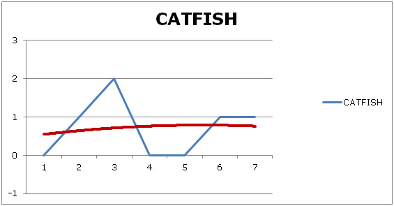
We can learn something interesting if we add a value of some kind to compare with this sequence. Suppose the reader is looking for a pattern of how many times they eat catfish over seven weeks. The reader then perceives a pattern; which weeks did the reader eat catfish? Does one eat catfish more often as the weeks pass? Will the reader eat more or less catfish in the future?
 |
|||||||||
|
WEEK 1 |
2 |
3 |
4 |
5 |
6 |
7 |
|||
|
CATFISH0 |
1 |
2 |
0 |
0 |
1 |
1 |
|||
What one learns is that it is likely that catfish will be eaten a little less than once per week over time (red line). Of course, with more values, the chart becomes more accurate.
High School history generally is taught in a similar arithmetic fashion; dates of history are an important measure of occurrence but do not measure parallel events. Events occur but they are measured by the year in which they occurred (Magna Carta signed in 1215, Columbus sailed the blue in 1492, The Declaration of independence was 1776, the first black President in 2008, etc.) This arithmetic progression shows little more than the sequence of historical events. One is left to surmise whether there may be a continuous relationship with other events.
What may provide a more valuable insight to us is the measure of two values not based on time but on the changing relationship between the events.
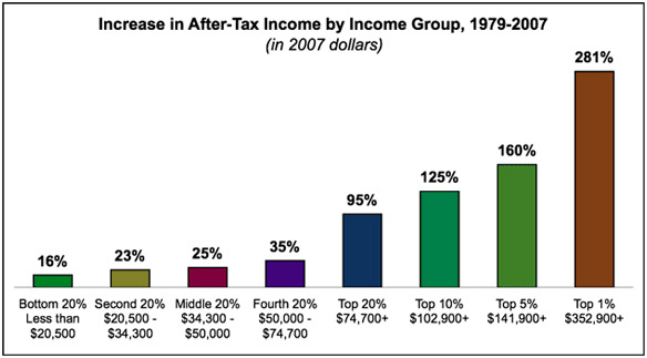
The following chart demonstrates the drawback phenomenon in a graphic. The latest date on this graph on this graph is 2007 but this disparity continues through today.
The next graphic relates how salaries have not stayed with inflation and continue even today to fall further below inflation. One does not need numbers to have the intuitive insight that the United States economy is broken. Percent increase is at the left of the chart.
INFLATION/INCOME
PERCENT EVERY FIVE YEARS
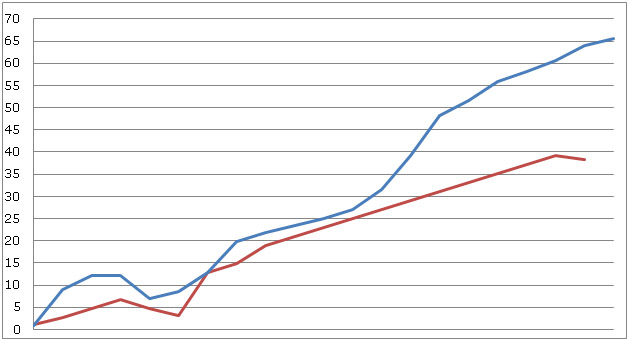 1913 1930 1950 1962 1988 2012
The dip between zero and twelve percent reflects the Great Depression. The straightness of the red line indicates that salary increases have risen around one percent per year for forty years. At the end of 2008, income falls away sharply, placing income 25.6 percent beneath inflation. For a salary of $20,000, it would require a raise of $781.25 to match inflation only in 2008. Income lost to inflation from 1978 to 2008 amounts to approximately $26,840. When one considers that most workers receive a larger income and there are millions of workers who share this shortfall, it is a staggering amount of income – a drawback likely to cause a tsunami at some point.
Next post: Some ways we can fix our Country.
Ancient Mariner